
Optimizepress templates are failing marketers and business owners on a day-to-day basis.
A few days ago I got talking to Richard Matharoo on one of my favourite social networking sites Google+. He asked how I get traffic to our Fridge Magazine website. I have had a number of questions about this recently so as mentioned in the video above we simply make the most of the traffic we do have and encourage people to share our content and become fans.
Then I thought I would have a quick look at Richard site http://www.richardmatharoo.com/. I was greeted with this:

This is a sight you see all too often around the Internet. A mishmash of optin boxes and random bits of content desperately trying to grab the viewers’ attention. This seems to be an common trait among many Optimizepress based websites. On so many levels this site fails to even meet some basic web design standards and principles. However if we step past the funky HTML coding, accessibility issues and restrictive CSS and look at the aim of this website we notice hundreds of bad marketing practices often seen on unoptimized websites today.
The basic aim of this website is to get potential customers to optin to an email marketing list or buy Richard’s products right now. With this in mind let’s look at just some of the basic steps that could be taken with a site like this to get some quick wins and optimise the site for optin’s and sales.
Two-Step Optin’s
This is the process of removing the input boxes from the visible screen as you can see below:

And actually adding another step into the optin process. So turning the call to action into a button or link of some sort that then takes you to the place to optin. Yes by actually adding a step you will increase conversion rates by 60% – 90%. There are two main reasons for this:
- Reduce Clutter And Focus The Attention
When someone is looking at your website having lots of input boxes just clutters the screen up. It takes people’s attention away from your offer/optin bribe and focuses their attention on the scary prospect of giving the email address away. Not to mention extra personal information like a request for their first name in the case of Richard site. The people to optin here they have to think about going through three steps, one enter their first name to enter their email address and three click the call to action (CTA) button.
- The Micro ‘Yes’
It is a well-known fact among psychologists that if someone commits to a small yes then there are a lot more likely to say yes to your bigger request. So by simplifying the call to action down to just a button people are left with the decision of do I want the optin bribe or not. After committing to receiving the optin your customer is then a lot more likely to want to comply with your bigger request asking for an email address. People by nature also don’t like to leave things half done. So by going halfway through the process of accepting the idea of an optin bribe they feel compelled to complete the process.
This is just a very basic overview of the reasons to create a 2-step optin process. I will return to this subject in the near future and go through the psychology behind them and how easily create a 2-step optin process in depth in a future article.
Remove Sidebars
For many years websites have had a two column layout. However if we look at it from the customer’s point of view and a marketers point of view we have to question if sidebars are still relevant today. As you can see below this like many sidebars you see across the web has lots of distracting pieces of ‘content’, well that’s if you would even call it content.

For many years sidebars have not offered potential customers enough value for them to take them seriously. This means these days most people just blank them out.
In this case there is so much content in the sidebar that people who may want to interact with it end up with choice paralysis. There are also two call to actions sitting one top of each other confusing the reader where they should go.
Most probably people have come to your website because they found your content either on a social network or via search. So the idea of creating this content is to build trust with your new prospect. However placing the call to actions almost before the reader has had any chance to get to know you and understand you are an expert will inevitably lead to very low click through rates, and very very low conversions the other end.
“Oh yes don’t forget about mobile, or in other words 60% of your audience.”
On 99% of responsive websites the sidebar area collapses underneath the main content itself. (And if your site isn’t responsive catch up Google now ranks mobile friendly sites above non-mobile friendly sites). This means that anyone viewing the website on a mobile might not ever see this content as it’s hidden away under the reason they came to your website, to engage with the main content.
To having only just scratched the surface with the reasons that sidebars are ineffective these days you have to question if it’s worth even having then there. And if there’s no reason why load the content inside them as it will only slow your website down. And as we all know the longer a website takes the load the fewer people will end up seeing your content and Google won’t rank you highly.
The Top Right Hand Corner
People naturally look to the top right-hand corner of anything. So in the context of a website the first place they going to look when your website loads is in the header and the top right-hand corner. Below we can see the Richard has use this to be picture of himself and put his name in the top right-hand corner.
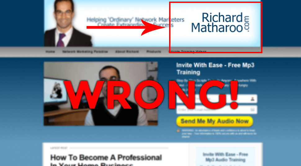
On many sites you also see lots of social icons or like buttons in the top right-hand corner. However this is a prime area to put your call to action, or the main focus of the website such as a telephone number.
Blog Post Pages
The blog posts/articles or educational resources pages as I like to call them are probably the first page people I going to see when they come to your website. Your potential customers have come to this page because they have seen your content shared on a social network or via search. Having come to your site your most probably going to have to build trust with them before they take your call to action.
In the picture below is a pretty standard messy Optimizepress layout, that is also common among many other website designs today.

To really make the most of this vital page when your website and build trust with people to eventually guide them to your call to action you can do a number of simple things:
- Always include a clear call to action at the end of every blog post.
- Include a simple, image heavy related post area
- Never use more than one comment system as this will only confuse people who potentially might want to interact with the content.
I will expand on all of the above and how to implement them in a future article.
Make Use Of The Footer
Very often the footer is underused on a website. In this case is that she nothing there:

Sure it’s a good place to put all the necessary but not call to action focused links and the copyright information for the website. However just by the fact your potential customer has managed to get your footer means they’d most likely consumed the content provided and having clicked away yet. So the footer is a great place to continue building trust and place optin’s.
You could do all kinds of things such as include images or logos of places in the media you have appeared, or add a call to action (preferably a two-stage optin). You could even put a link to your most read post or the most shared post as if they click on here and share this on is going to bring more traffic back to your website.
Conclusion
Much of the advice above is extremely easy to implement and is really focused around removing clutter and focusing people to well-defined call to actions. So a few simple questions you can ask yourself when looking at your website:
- Am I giving potential customers the opportunity to build trust with me?
- What courts to action to I want my potential customers to take?
And last of all if you’re using premade template web designs or systems as Optimizepress templates consider if they are actually the best setup to use on your whole site. Or is it better to use a fantastically designed blog template and use tools and systems such as LeadPages for your optin pages.
Can’t see the video about how Optermizepress Templates are Failing Marketers above? Click Here: https://www.youtube.com/watch?v=PEWTEpmHuis

I really like your articles. Please do write on colors and fonts with images.
Hi Ambereen,
Thank you for the comment. Just to clarify would like me to write about the relationship between colors and fonts? If so i am more than happy to do that.
Henry
Very thought provoking article that challenges the norm and conventional thinking. Do you really think that there should be no sidebars? Man, I am not convinced of that, but I do get the idea of having a site that is not cluttered and overwhelming. Do you have any examples of what the ideal site should look like. Thanks for your insights and look forward to your comments.
Hey Steven,
Appreciate the comment. Yes i know this is going away from the norm. So there are a few figures i have left out of this article as i’m going to go into this in more depth.
– One figure i did mention in this article is 60%+ of internet usage is now on a phone where they won’t see the sidebar anyway. So it’s worth first checking your analytics and thinking about how people are actually viewing your site to start with.
– Next most people now don’t see them as mentioned in the article. This is because they have been miss-used for years with designers filling them with junk. On an average good site sidebar will receive 1% click through rates. I have actually been doing a study on my companies site http://www.fridgemmagazine.com and some of my clients site. And we have seen the 1% figure as well. However if we put a CTA (call to action) under a article we see click through/opt-in figures more around 4 – 5%.
Here are a few sites that are pulling off the no sidebar design really well:
https://premium.wpmudev.org/blog/
http://preneurmarketing.com/
http://iamkevinrhodes.com/blog/
https://blog.bufferapp.com/
So this takes us onto another point. Sidebar’s have historically been used to sell. However you can’t sell something before someone has built up some trust with you. So maybe the problem with the sidebar is whats in the sidebar rather than the pure fact they are there and can take the attention away from an article.
The solution is to put only things that don’t take you away from the article such as social profiles and some valuable info like an about us/me section.
As ever best practice and design will differ for everyone. And there is nothing like split testing to find out what works.
I will expand on all this and more in an few articles coming out soon. So look out.
Good to meet you Steven & i look forward to continuing this conversation on here and G+, Twitter.
Henry, I liked your article and I even shared it, BUT you need to use a grammar checker, such as Grammarly or Ginger. There were many mistakes that make the article less professional. For example: Most probably people have (People have, most probably, come to your website)….low conversions (at) the other end…In this case is that she (there is) nothing there:…
Anyway, thanks for the article. I found it very informative and helpful.
Hi Fred,
Thank you for your comment. Please see the below video for my reply.